I just got back from Snap Conference. It was epic! I think something that a lot of people don’t realize, is the amount of prep work that goes into getting things ready to go before leaving to go to a blog conference. That is why I am making this week…
I am dedicating an entire week to telling you all about the things that I am sure to do before going to blog conferences. Today is all about creating that business card! I get a new business card design every year right before I go to Snap Conference so that I can evolve a little bit and change a few things each year. I want you to know a few tips to creating the perfect business cards for your own blog too!
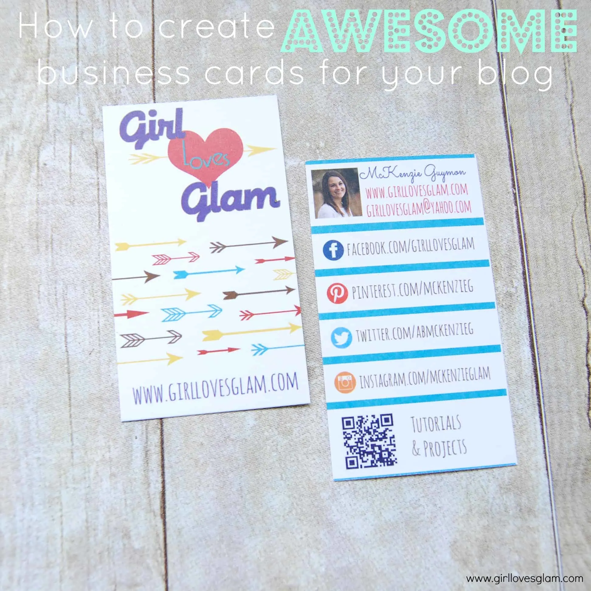
1. Choose colors and design that reflects who you are! I can’t stress enough how important that is! You want people who receive your business card to really get the vibe of your style, just by looking at your business cards. I LOVE arrows and geometric patterns. There are a lot of patterns and bright colors in the projects that I do on my blog, so choosing bright colors and a fun arrow pattern made sense for my business cards.
2. Put your picture on it. People are much less likely to throw away your business cards if your picture is on it. It is also much easier to remember someone that you met if you can go back and see their photo on their business card. It is all about face recognition!
3. Make your blog address and name easy to find. This seems self explanatory, but you would be surprised how many business cards are too caught up in the design, that it is hard to find the actual blog name and address on them. Personally, I like dedicating an entire side of my business card to the name and URL of my blog.
4. Put your social media info on your card. Maybe someone is too afraid to commit to following your RSS feed. Following on Facebook, Twitter, etc. is an easier, less committed way to follow a blog. If you are like me and have different names on each of your social media outlets, this is especially important! It is hard to find someone if their name isn’t the same as their blog on different social media outlets.
5. Add a QR code, but DON’T direct it to your home page! If you have your homepage URL written all over your business card, what is the point of adding a QR code that goes to the same spot? Send them somewhere else! Even better, give them some incentive to scan that QR code, like a secret printable or something. I wanted people to be able to scan my QR code and instantly see all of the projects you can find on my blog! Mine sends them to my tutorials page.
6. Spell check! This probably sounds like a “duh” suggestion, but there are tons of typos on business cards! I had a friend who’s business cards at the salon said she was a “cosmotologist” instead of “cosmetologist”. We would tease her all of the time that she didn’t do hair for the stars as in celebrities, she did hair for the stars as in space. Not good! I also saw a few typos of Pinterest spelled as “Pintrest”. Both of those examples can be missed pretty easily because it is so close to the real word. Have someone else look at your business cards too to be sure everything is spelled correctly. I ALMOST missed one of the l’s in www.girllovesglam.com! That would have been so bad! Thankfully, my husband caught it.
7. Choose a good printer. Don’t print your business cards at your house! There are several reasons why you shouldn’t do this, but one of those, is that your printer probably isn’t a high enough quality printer to be printing business cards. You want them to be crisp and look fabulous! I recommend going to a good local printing place (my preference), or ordering from a high quality printing service online.
8. Be willing to spend a little extra on paper. I loved the paper my business cards were printed on last year. I had gone to a local printing company and I got to physically touch the paper before I chose it. It was totally worth the money for the paper I chose. This year, I printed them online and just got the paper that was included. Bad idea! I wasn’t happy with the quality of the paper at all.
9. Use easy to read fonts. Nothing is more annoying than getting a business card that you can’t read! Make your text big enough to read and make sure that it is a font that can be easily read.
10. Pimp up your business cards! Add something to your business card to give out. This will help make you a little more memorable! I will tell you more about that tomorrow!


Crap I learned at Snap
Thursday 25th of April 2013
[...] you missed the previous days of Blog Conference Prep Week, check them out here, here, and [...]
What to take to a blog conference
Wednesday 24th of April 2013
[...] Prep Week! In case you missed out on the first two days, you can find the one about business cards here and the one about pimping up those business cards [...]
Blog Conference Prep Week: Pimp Those Business Cards!
Tuesday 23rd of April 2013
[...] I hope you all are enjoying this little series that I am doing! I will probably come back to it myself when I prep for my next blog conference. If you missed it yesterday, I talked all about what you should include on a blog business card. You can find that post here. [...]
Lindsay
Monday 22nd of April 2013
These are fantastic tips! I am a writer and editor, and typos on business cards are an instant turn-off. They just show carelessness, unfortunately.